Information Design - Animated Infographic Poster (Project 1)
19/2/2025 - 10/3/2025 (Week 3 - Week 5)
Katelyn Tan Kye Ling (0354148)
Bachelor
Of Design In Creative Media (Information Design)
Project 1: Animated
Infographic Poster
LECTURES
Week 3:
Lecture: 17/2/2025
Today's lecture was about the Miller's Law. And here was what I learnt
about it:
Miller's Law: a psychological theory that states the average
person can hold about seven items in their short-term memory.
We then watched a video to further understand the theory. (Click here for video)
Video Notes:
- Introduction to Miller's Law
Miller's Law establishes that the average number of discrete items or
bits of information that can be held in our working memory is
approximately seven, plus or minus two. This theory helps to explain the
limitations of human memory and how we can better structure information
for easier recall.
- The Magical Number 7
The concept of the 'magical number 7' refers to the tendency of people to remember about seven chunks of information.
- Application in Productivity
Understanding Miller's Law can enhance productivity by encouraging the organization of information into manageable chunks, which aids memory retention and recall. This principle is applicable in areas such as content creation, data presentation, and collaborative work environments.
- Implications for Learning
Miller's research outlines strategies for educators and trainers to present information in a way that aligns with our cognitive limitations. By segmenting information into smaller, digestible units, learners can process and retain more effectively.
My application of the Miller's Law:
Sometimes we use the Miller's law in our daily lives without noticing!
Here's how I think I've applied the Miller's Law in my daily life in the
past and present before even knowing about the theory.
- One of the times I've used the Miller's Law is when I'm designing for apps or websites for my school assignment. Like limiting menu options, buttons, or categories for better usability and UX.
- Another habit that I do on a daily basis is use a to-do list for task management. Many modules have mini tasks within a project which I cannot remember what is there to do. So I have an app to list down my tasks for each module.

Fig 1.1 My To-do List
- Another thing we do is when we create presentation slides. We create bullet points for information keeping it 5-7 points to avoid overwhelming the audience.
Tutorial: 20/2/2025
I wasn't able to make it to class. However my teammates helped me
to consult with Mr. Fauzi regarding our progress and Mr. Fauzi
gave us some feedback. He also briefed us on Project 1 to start
picking our infographic poster to redesign.
Week 4:
Lecture: 24/2/2025
As usual we started off this week with a lecture followed by the
FLIP presentation.
Lecture Notes:
Manuel Lima's 9 Directives Manifesto
1. Form Follows Function: The initial stages of a project
should always start with a question. Make the objectives the main
focus, leading to further discovery.
2. Interactivity is Key: Allows for investigation and
learning through discovery.
3. Cite your Source: Always disclose where your data
originated.
4. The Power of Narrative: Elaborate your information into
storytelling to make it more interesting and memorable.
5. Do not Glorify Aesthetics: Aesthetics is important but
it should not be too heavy-handed. We still need to focus on the
purpose of the infographic itself.
6. Look for Relevancy: "Why are you visualizing the
information?" Keep in check the relevance of what is being done to
what the final outcome is.
7. Embrace Time: Time management is one of the key factor
to organize and achieve better results for any decision making,
Set a parameter.
8. Aspire for Knowledge: Visualization is to translate
information into knowledge. Every project should make the
information even easier to understand.
9. Avoid Gratuitous Visualtisation: Simplified designs are
the best, don't make anything too complicated. Avoid unnecessary
or uncalled for visuals.
Tutorial: 26/2/2025
This week, we had online class. Mr. Fauzi gave us feedback, and
after hearing other people's feedback, I felt like I have to
change my poster as it is "too nice" as a reference poster. I
decided to change and go with another one poster.
Week 5:
Lecture: 3/3/2025
Constructive Workflow: A Constructive Workflow
helps align your thinking with digital tools, making work easier
and more efficient.
-
Mind-Workflow Synchronization
- Structuring tasks to match natural cognitive processes.
- Reducing friction between thinking and execution.
-
Digital Fluency
- Mastering digital tools to improve efficiency.
- Understanding computational logic to enhance creativity.
-
Balanced Cognition
- Utilizing both analytical and creative thinking.
- Avoiding cognitive overload by optimizing workflow.
Benefits
- Improved Focus: Less mental strain in task management.
- Increased Creativity: Seamless transition between ideation and execution.
- Efficiency Boost: Optimized workflow reduces wasted effort.
Conclusion
Adopting a Constructive Workflow can lead to more
productive and creative outcomes by integrating structured
methods with intuitive digital processes.
Tutorial: 5/3/2025
Weekly consultation regarding my project 1's poster. Mr. Fauzi
said we all had to simplify our posters and animate them. We also
had to change the size of it. He also extended our duedate for us
till next Monday (10/3/2025).
INSTRUCTIONS
Project 1 - ANIMATED INFOGRAPHIC POSTER
PART 1: Infographic poster
INSTRUCTION
1. Choose 1 infographic poster reference from Internet (Please consult before proceed)
2. Redesign the poster into A4 size. Sketch the idea and process
3. Redesign and simplify the poster based on visual hierarchy & typography
4. Simplify the poster's design based on color, shape & pattern
5. Attach your final poster on E-Portfolio with explanation and reflective writing
PLANNING
PLAN: Attempt 1
Firstly, I chose a few poster reference and picked the one that I felt
would be the most interesting. After that, I analysed the poster to see
which parts I could change. Then I also wrote down my plan along with the
information that I want to include in my redesigned poster.
(View link below for full plan inclusive of: Poster reference, Chosen
poster, Analysis, Plan, Information to include & Sketches.)
Click for Plan 1
NEW PLAN: Attempt 2
At first, I already went with a poster reference and did some sketches.
However I felt that the poster reference was too nice and Mr. Fauzi agreed
with it as well. He mentioned that I could simplify it and organise the
first reference poster better since I've already done sketches. I also
found a few more posters as back up, so I showed him those as well. He
suggested I do the poster about smoking as it can educate others and the
poster doesn't look that nice so redesigning it would be a good
choice.
(View document below for full plan inclusive of: Poster reference,
Chosen poster, Analysis, Plan, Information to include &
Sketches.)
FINAL PLANNING
FINAL CHOSEN POSTER REFERENCE:

PROGRESS
Attempt 1
I really liked the concept of sketch 1 which was the cigarette box poster
so I decided to give it a go even though it was really challenging. I
first made the cigarette box with a reference.

Fig 2.1 Poster Layout - Cigarette Box
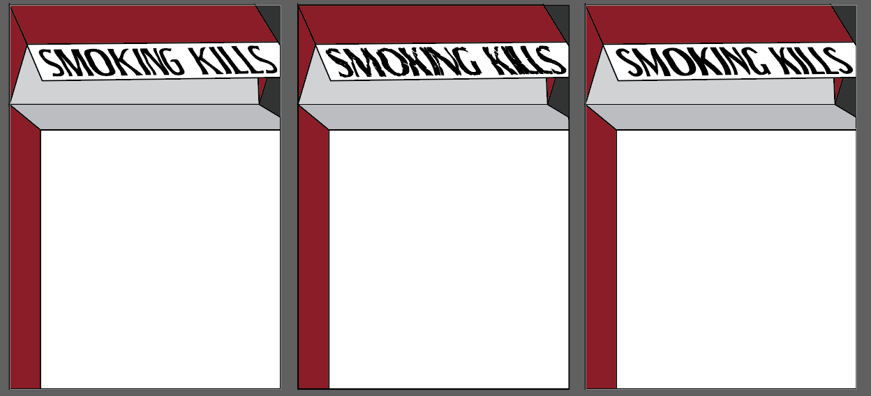
Fig 2.2 Different Fonts
I made the words slanted so the it looks like the box is from a slanted
point of view. Same for the images as well.

Fig 2.3 Attempt 1 trials
Attempt 1's final poster:

Fig 2.4 Attempt 1 Final Poster
Attempt 2
In attempt 2, I decided to do sketch 3. I went with similar red shades
from attempt 1. I personally liked this one much better than the
previous one as it looked much cleaner so I went with this (Fig 3.1).


My friends then said that the triangle layout was actually distracting
and took up a lot of space which didn't leave enough room for the
information and makes the poster look very cramp. They also mentioned
that the graphics were hard to see from afar and that it didn't really
match the entire poster's style.


PART 2: Minimal animated infographic
INSTRUCTION
1. Animate your infographic poster into one static loop animation page
2. Loop duration in between 15-30 second
3. Size: 1080 x 1920 px (Vertical Video) upload to your own Youtube channel
Fig 3.1 Attempt 2 - #1
I asked Mr. Fauzi and some friends for some opinions on this poster.
Mr. Fauzi said that brighter colours for the background would be
better. However when I tried that, the reds were too bright and there
wasn't much contrast between the information and the background.
Fig 3.2 Attempt 2 - #2
Attempt 3
I altered the poster according to the feedback. I traced the icons one
by one so that each line width would be consistent through out. I also
gave lesser space to the section below as that wasn't the main
section. I also made the layout to boxes instead of triangle and had
lesser sections by using a line to separate the sections. I believe
that it looks way neater and simplified. Whereas the initial poster
was cluttered and all over the place.
Fig 3.3 Grid Version
Fig 3.4 FINAL POSTER OF PROJECT 1
INSTRUCTION
1. Animate your infographic poster into one static loop animation page
2. Loop duration in between 15-30 second
3. Size: 1080 x 1920 px (Vertical Video) upload to your own Youtube channel
SIMPLIFIED POSTER FOR ANIMATED VIDEO
The one on the left side is the first idea I had, then I felt that the middle was too empty so I changed up the layout and came up with the second one. I wanted to animate the cigarette as well so I drew it on illustrator and the second image in Fig 4.1 is the final simplified poster to be animated.

ANIMATED VIDEO PROGRESS
Plan:
Title: Fade in + Flicker
Cigarette: Smoke + Glowing tip
All Icons + Text Transition in: Scale from small to big + Text comes out
of the circle
Addiction Icon: Cigarette spinning in the mind
Lung Disease Icon: Inhale exhale of lungs
Miscarriage Icon: Baby's opacity decreasing and increasing
Heart Attack Icon: Pumping of heart
Bad Oral Icon: Bugs walking around
Firstly I imported my Illustrator file into After Effects. Then I wanted
to animate the smoke first by following a tutorial (Click
here for
tutorial), but the whole app was extremely laggy. I thought it was my
computer's issue so I tried to fix whatever the issue was but it didn't
work. I then searched it up and found that too many vectors could cause
this. So I edited the smoke in another file and then copy pasted it back
into the original file (Fig 4.2).

Fig 4.2 Animating Smoke in After Effects
Later on, I proceeded to work with the title. The blur effect that I did
in Illustrator couldn't be supported in After Effects. So I deleted it and
redid it in after effects itself. Then I proceeded with the icons and text
animations. And lastly, I did each icons individual animation. Then I was
doneee!!

Fig 4.3 Animated Poster in After Effects
PROJECT 1 FINAL SUBMISSION
REDESIGNED INFOGRAPHIC POSTER:

ANIMATED INFOGRAPHIC POSTER
GOOGLE DRIVE OF ALL ORIGINAL FILES:
FEEDBACK
Week 4 - 26/2/2025
Dream Poster:
- Reference poster looks nice already, redesign poster will be hard to
beat this poster.
- Second sketch for the dream poster is good to go.
- Try to go for something different, don't make it too similar to the
reference poster.
- The reference poster has too much information and unorganised, can make
simplify it.
Second poster choice:
- If change poster choose the smoking one.
- If change poster choose the smoking one.
- Can just do two sections: "How to stop smoking?" and "Effects of
smoking"
- Can add information and don't have to use everything in the poster.
- Can find better images, the reference poster is just cliparts
Week 5 - 5/3/2025
- Poster 2 is better than poster 1 but suggested that the background is
slightly slighter.
- Animated video can be simplified, no need to add everything from the
redesigned poster.
- Vertical animated video not A4.
REFLECTION
Findings
Experience
Over the past few weeks, I worked on Project 1: Animated Infographic Poster, which involved redesigning an infographic, simplifying the poster and then animating it. Initially, I chose a poster that looked too good as a reference, making it hard to improve upon. After receiving feedback from Mr. Fauzi and my peers, I switched to a different poster about smoking. The process of redesigning the poster required multiple iterations, and I had to make adjustments based on feedback, such as simplifying the layout and improving the visuals.
Moving on to animation, I faced challenges with After Effects, especially with lagging issues due to too many vector elements. Despite the technical difficulties, I managed to troubleshoot and complete the animation successfully. Overall, this project was pretty fun although there were many bumps along the way. However I'm glad I pulled through.
Observation
Throughout this project, I noticed that feedback plays a crucial role in improving design. Initially, I was attached to my first choice, but after listening to suggestions, I realized that my second choice was a better fit. I also observed that simplifying designs makes them more effective. The initial version of my poster felt cluttered, but after applying visual hierarchy and organization techniques, it became more structured and readable. Additionally, I learned that working with digital tools like After Effects requires patience, as technical issues can slow down progress. However, breaking down the animation process into smaller steps made it easier to manage.
Findings
From this experience, I learned that design is an iterative process. What seems like a good idea at first may not always be the best approach, and being open to change is essential. I also found that simplifying content enhances clarity and impact, which aligns with design principles like Miller’s Law and Manuel Lima’s directives. Moreover, handling technical issues taught me the importance of problem-solving and adaptability. Overall, this project helped me develop better design judgment, improve my workflow, and strengthen my animation skills.


Comments
Post a Comment